Methods for Vector Display of Internet Artifacts
You Know The Rules And So Do I
By Štěpán Davidovič with Salim Virji
One way to learn about distributed systems in depth is to creatively misuse them, and find the limits of their flexibility. Thus, one year when April Fool's came along, I took the opportunity to do just that - Google as a whole has quite a history of April Fools' jokes.
I am a frequent user of Monarch, Google's planet-scale monitoring system, and Panopticon (or PCon), its user interface. PCon displays monitoring graphs that contain up to 127 lines of information on how your system is doing. Monarch collects and stores metric data, and allows arbitrary querying using a rich query language: the python-based, domain-specific language called Mash. Google Cloud users may also recognize the Monarch Query Language.

A Mash query looks like so:
Fetch(Raw('example.production.Servers', '/my/service/errors'),
     {'user': 'stepand',
      'server': 'rickroll_server'})
 | Window(Align('1h'))
 | GroupBy([], Sum())
Now I wanted to take this Monarch system and creatively misuse it-that is, use it in an unusual way. What better way to do this than-wait for it-Rickroll Monarch?
For those that don't know, "Rickrolling is a bait-and-switch prank that involves posting a hyperlink that is supposedly relevant to the topic at hand . . . but redirects the viewer to the music video of Never Gonna Give You Up, a 1987 dance-pop single by English singer-songwriter Rick Astley."
So let's put Monarch and Rickroll together! How can we Rickroll Monarch?
Aside from the April Fool's joke, serious learning occurred, too. This project taught me about problem decomposition and being principled at cutting corners in exactly the right places. It helped me move from instinctive to deliberate when explaining why I felt this or that corner should be cut. And it gave me more familiarity with our monitoring system. And this prank was also a good opportunity to practice a thing or two about graphics and animation, subjects I find interesting in their own right.
Let's get started
Okay, so how do you get Rick Astley to show up dancing on your monitoring dashboard?
From the start, I wanted to use lines on Panopticon-that is, treat it as a vector display. It's a natural choice, given that in Panopticon, everything is a line. If we're doing vectors, what problems do we have to solve?
- Get the actual Rick Astley video. Turns out, this is not a big problem. There are a bunch of videos on the internet. Phew, I was worried for a moment!
- Turn the video into vectors. I'm okay with outlines, so we need one silhouette per each frame of animation.
- Take the silhouette and write it into Monarch correctly. There's a bunch of limitations to that.
- Display the animation at a sufficient refresh rate so that it actually looks like animation to people.

Source: Video capture from https://www.youtube.com/watch?v=dQw4w9WgXcQ
Bonus points: Don't melt Monarch in the process! Everything done here is an abuse of the system, of course, so I want to be careful. I need to learn a lot about the system first
From Rick Astley Video to Rick Silhouete
If we look at the Rick Astley video, we can see there's a lot going on: there's a complex background, a microphone, and of course, Mr. Astley is moving around quite a bit
My first thought was rotoscoping it. I've done that a few times for some amateur movie shots. It isn't too hard, but it takes a lot of effort-nope, not gonna happen.
My second thought was, has someone done this already? As a matter of fact, yes, someone did: Google! A few years back, Google Rickrolled the internet with a Rickroll in Webdriver Torso.
Ok, we've got a high contrast silhouette now. Still no vectors, but much easier to turn into vectors.
First things first. Let's download the video from https://www.youtube.com/watch?v=klqi_h9FElc and turn it into a series of frames:

$ mkdir frames
$ ffmpeg -i klqi_h9FElc.mkv -r 4 frames/output_%04d.png
Now that I have each individual frame, I only care about the red part of every frame (thanks, whoever made this Webdriver Torso video!). Shell script using Imagemagick makes quick work of that and leaves only the parts I care about. I found this Imagemagick invocation on the internet and just adjusted the colors:
$ cd frames
$ mkdir processed
$ for i in *.png; do convert "$i" -level 25%,75% -fill white -fuzz 10% +opaque "#f90000" "processed/$i.pnm"; done
Notice the ".pnm" suffix. This suffix indicates that I want the files to be processed by the next tool in the pipeline: potrace. It only accepts a few input formats. The resulting images may not be pretty, but they'll do. There are various minor blotches of compression artifacts, which I'm sure I could remove somehow, but these are corners I can easily cut later, so I didn't bother removing them now
In my experience, Potrace is probably the fastest, easiest way to convert an outline into vectors, for simple shapes. I frequently use Potrace in graphics work, to get SVG into Inkscape.
However, SVG is kind of awkward to work with, and I have many more steps left. Remember, I need to get this data into Monarch, which still requires a lot more processing. Also, Potrace generates Bezier curve definitions, which I'd need to turn into individual data points. Handling SVG and Bezier curves is a lot of work. Can I do something easier?

This is when I notice that Potrace supports "GeoJSON", a format I've never heard of before, but it conveniently dumps data into JSON. In addition, GeoJSON approximates Bezier curves by eight straight line segments. Score! Double victory!
Next, let's use CSV as a simple data interchange format. My data format is a CSV with three columns: frame number, point x coordinates, and point y coordinates. A single frame has a single silhouette, and the points are the outline of that silhouette.
I run a simple Python script and get this generated!
import csv
import json
import subprocess
import sys

with open('result.csv', 'w') as output_csv:
  writer = csv.writer(output_csv, lineterminator='\n')
  for index, fn in enumerate(sys.argv[1:]):
    print '[%d] Tracing PNM %s' % (index, fn)
    with open(fn) as input_pnm:
      p = subprocess.Popen(['/usr/bin/potrace', '-b', 'geojson'],
                           stdin=subprocess.PIPE,
                           stdout=subprocess.PIPE,
                           close_fds=True)
      stuff_from_pipe = p.communicate(input_pnm.read())[0]
      p.wait()
    print '[%d] Writing frame' % index
    data = json.loads(stuff_from_pipe)
    for item in data['features'][0]['geometry']['coordinates'][0]:
      writer.writerow([index]+item)
Woohoo, I got my CSV file with the animation!
From Rick Silhouete to Monarch Astley
I have a vector silhouette now, and my goal is to get it into the monitoring system - clearly a very reasonable goal. When writing to Monarch, you need to go from left to right, from the oldest data point to the youngest. Your next write must be for a later timestamp than the previous write, or Monarch rejects it. We need to follow this directionality requirement, instead of simply adding points clockwise around the silhouette and calling it a graph.
This requires some code. This code finds the leftmost point in the silhouette, and traverses clockwise and counterclockwise to find the longest segment, where the next point is not more left than the preceding point. Once such a segment is found, the segment is split off as an independent line, and we repeat the process all over again until we run out of lines. We then write those lines to Monarch as independent streams, with points ordered from left to right.
For testing, I add the option to dump this output into SVG, with a new color for each line. This helps to find various bugs in the algorithm, and nicely visualize what's going on.
Next, I use a library designed for bulk writes into Monarch. In order to keep the data separate from everything else, I use custom root labels, custom schema, and a custom metric. The metric is /experimental/stepand/rickroll/never_gonna_give_you_up, schema is experimental.users.stepand.and.RickAstley.

Each picture now has width, which is equivalent to a time duration. It also has height, which is the value of the time series.
Originally, I'd wanted to bulk-write one frame per second into Monarch, slightly into the future according to the PCon viewport. Each second would have been the one frame I'm interested in, and I would have narrowed the PCon viewport to a one-second width. Unfortunately, this was not possible. Streamz API prevented me from writing two data points for the same metric, in the same write. I also could not write quickly, because I was hitting issues with reordered writes (recall Monarch wants them in chronological order) and my naive implementation couldn't write fast enough because of this requirement.
I still have other options:
1) Work around the reordering problem by writing one data point per one stream.
2) Create new targets or new metric fields.
3) Find another solution to the whole animation question.
I start with the first option but quickly realize that the total number of points for all frames is around 20,000. Having one stream per data point is a very inefficient use of Monarch, because it is a mismatch to a typical time series (with one stream running for a long time), and goes counter to the physical storage model. I conclude that I can't render a frame very fast this way.
Therefore, the other solution is to write slowly. Writing the entire image takes about 20 minutes now, and the viewport is one hour wide. Instead of writing just one frame, it now writes all frames. Each frame has a different target, so they can be filtered individually.
On-Screen, Data
When does PCon connect two dots, and when does it leave a gap? Through trial and error, I learned that PCon looks at the last Window() statement in the query. Therefore, I use this to interpolate points and ensure lines are continuous, even if the original vectorization has a long gap.
This is kind of awkward, since it increases the number of points written. However, it leads to a substantial increase in picture quality. This is also very useful for the lettering (see section, Writing On The Wall), and saves me much manual labor by making it legible.

Animate!
Okay, on to the last step: how do we animate? Well, PCon has a feature where it automatically refreshes the graph as often as you'd like.
We write individual frames to Monarch, and set the refresh interval to one second. The last thing we need is a way to decide which frame to render. Essentially, we need a clock with a one-second precision.
This simple query gives us the number of seconds since the start of the hour:
Fetch(Raw('experimental.users.stepand.and.RickAstley', '/presence/found'),
{'give': 0, 'gonna': 0, 'never': 'global', 'up': 0, 'you': 0})
 | Filter(False)
 | Window(Align('1h'), '1h')
 | GroupBy(['never', 'gonna', 'give'], PickAny())
 | JoinWithLiteralTable(target_schema_name='experimental.users.stepand.and.RickAstley',
fields=('never', 'gonna', 'give'), streams=[('global', 0, 0, True)], input_default=True)
 | Point(TimestampMicros())
 | Window(Align('1h'))
 | Point(Floor(VAL / 1000000) % 3600)
We use this query and join it with the stored data, and only filter the frame we want. Simply take the stream value modulo number of frames (which is 21), turn it into a field, and join it against the original data.
It turns out, we can also use this query to solve another problem. When displaying time series, we always see only a limited time window. After a while the image starts to slide to the left, out of the left edge of the window, and we only get a part of Rick Astley. By using time shift, however, we don't even need to write twice: we just move a single set of frames to the right! Therefore, we use this timing information to decide whether to shift right or not. The entire animation is approximately 30 minutes wide (quite a great width unit)! When the leftmost edge of the data hits the leftmost edge of the viewed window, we just shift it by 30 minutes to the right. After another 30 minutes, we remove the shift, but load data from the new data push.
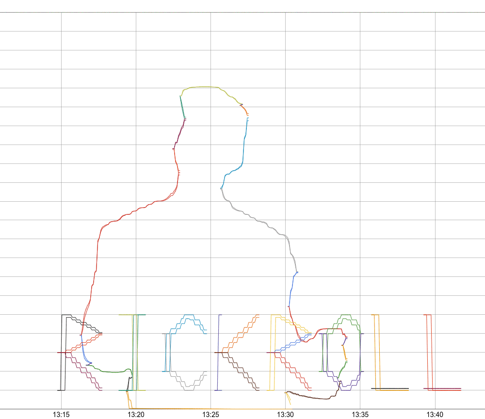
Here's how it looks, all pulled together: check out the result here!
Writing On The Wall
I worry that the Rick Astley silhouette may not be immediately recognizable, so I decide to add some writing to drive the point home.

Now that we have a general vector display, the lettering is really the easiest part. I manually prepare a bunch of letters as vector paths, and then the code scales them and writes them to Monarch, just like the other vectors. There are just minor improvements, then, to the lettering over time, to make it more legible.
Final Thoughts
This was a fun project, and there were many details I had to solve which I don't go into here.
Pcon Rickroll was a good exercise in project decomposition: how to go from a bizarre and ambiguous problem statement, to concrete subproblems and their concrete solutions, while staying within the limited time budget I'm willing to dedicate to a joke. It helped me be more principled in identifying where to cut corners to maximize impact while minimizing effort: I could have rotoscoped the whole video, had a more robust vectorization, or better graphing-a colleague recommended using histograms, which can be used to construct grayscale bitmaps. However, recognizing what was "good enough" for each step helped me actually pull off this April Fool's joke. I could not spend an infinite amount of time, so this strategy made the difference between making this project feasible or not.
On a final note, I'd like to thank the outstanding engineers working on Monarch. The Monarch system is one of the most exciting services I have the pleasure to use.